The Anatomy of a Likeable Patient Statement
March 1, 2013 •Brian Watson

 Patient, statement and likeable aren’t three words that you’ll find side-by-side in a sentence all that often.
The reason for that is simple: patients are often really frustrated by medical billing. According to the 2011 Connance Consumer Impact Study, only 21% of patients are fully satisfied with their hospital statements.
And that affects their overall opinion of your organization and its doctors, too. The same study reported only 39% of patients that were dissatisfied with their billing would recommend a clinician, compared to 91% of patients that were fully satisfied.
Let’s be honest - most of us will never be jumping for joy about having to pay a bill. It’s always going to be a necessary evil. But that doesn’t mean that your patients should actively dislike your billing. And it definitely shouldn’t have a negative impact on patient satisfaction or their willingness to recommend your doctors.
But what exactly makes a patient statement likeable? And how can you ensure that your billing is living up to your organization’s patient-focused outlook? Well, you can start by checking out this post for 11 traits shared by highly effective statement processing solutions.
It’s Loud
It may not necessarily enhance the aesthetic quality of your statements, but large type is definitely a key feature of likeable statements.
Almost 75% of Americans use glasses or contacts. On top of that, nearly 11 million Americans have an undiagnosed vision problem.
Don’t be tempted to make up for the lack of statement space by using excessively small type. Any type that’s smaller than 8-point can be challenging to read for the many of your patients.
The default type size for most books and magazines is 10-point. Consider that the minimum standard for likeable statements. And the most important stuff – payment info, account summaries, payment channels – should be even larger than that.
That goes for fillable forms, too. Use large fields on the payment or insurance change forms you want patients to complete by hand and remit. Because, it’s really hard to write legibly in forms that would be a snug fit for 8-point Arial type. Trust me: both your patients and the patient financial service reps that have to transcribe the forms will thank you.
And Clear
Don’t over-think your statement font. This isn’t the time to trot out that experimental new type family you’ve been itching to use.
Research shows that clear, legible, familiar fonts in colors that maximize the contrast with the background (like black) are more likely to be processed and accepted quickly than those that are harder-to-read or printed in faint colors (like gray).
It’s a process called cognitive ease – and it works because it leverages familiarity. Patients don’t’ have to strain to decipher a legible bill. And that makes it easier for them to understand and trust your message.
It’s Bold
Bold colors are ideal for calling attention to the most important parts of your message – like balance due and payment date. And red and bright-blue shades are the most effective communicators.
They create a better contrast with their surroundings than middling shades like yellow, green or pale blue – and are therefore easier to process and more likely to be believed.
But don’t overdo it. Overusing color lessens its impact. And certain shades – like bold reds – can actually be counterproductive if used too much, causing visual exhaustion and stress.
It’s Clean
Clutter is a real detriment to the billing process. Likeable statements allow patients to quickly understand their bill and take action on its cues. But a design that’s too chaotic or information-stuffed is likely to have the opposite effect – leading to more cognitive strain, frustration and billing questions.
Use white space to give your statement design room to breathe. It’ll make it easier to guide the patient’s visual path and help them quickly soak-up key billing details.
It’s Concise
Information is easier to digest when it’s short, simple and to-the-point. That’s the main benefit of call-out account summaries.
Part of the reason that patient statements get such a bad rap is the sheer amount of information they present. Insurance payments, payments the patient’s made, in-depth treatment details – it can all get overwhelming.
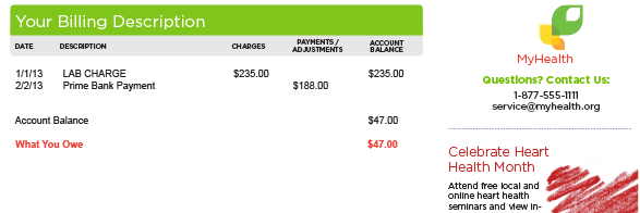
A simple account summary provides an easy-to-follow summation of the patient’s bill – what they've paid and what insurance has paid - culminating in a clearly marked balance-due. In other words, it’s the kind of thing patients have been after for years.
 A clean, simple billing summary helps patients quickly understand what they owe.
It’s Familiar
No, your logo or color scheme isn’t, in and of itself, a feature of likeable statements. After all, patients don’t receive any tangible benefit from your organization enhancing its brand awareness and equity. That’s good for you. But what’s in it for them?
Well, repetition of brand elements creates familiarity. It helps patients quickly identify the billing entity and who they should pay. So customize your statement to fit your brand. And use a double-window outgoing envelope to make sure your logo and return address are easily identifiable to patients before they even open their statement.
And Helpful
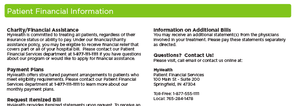
Likeable statements are helpful statements. They provide patients with tools and information that answer common billing questions and simplify the payment process.
In other words, likeable statements show foresight. Because billing issues are inevitable. And many patients aren’t aware of the options they have for managing their financial responsibly – whether that’s financial assistance or payment plans that spread out a lump sum balance due over several months. Likeable statements include stuff like:
• Easy to find customer service information, including phone, email and online patient support tools.
• An overview of your financial programs – like charity/financial assistance and payment plans - and contact information for patients who'd like to learn more about meeting eligibility requirements.
• Information for patients that want to request an itemized bill.
• A list of common billing Frequently Asked Questions.

Give patients the information they need to make educated payment decisions.
It Sets Expectations
One of the reasons people become disappointed about a product or service is a failure to set proper expectations. Think about it: you’d probably be a lot angrier about a wood-paneled steakhouse overcooking a $50 steak than you would a fast-food restaurant forgetting to put extra pickles on your chicken sandwich. That because your expecations of fast-food are typically much lower.
Likeable statements clearly depict what’s expected from patients: what they owe and why, when a payment is due, how many statements they’ve received (and will get per visit) and when an outstanding balance will be turned over for collection. No surprises. No fine-print. Payment terms are out in the open - fully transparent and patient-friendly
It Motivates
Sometimes patients might need a little extra incentive to make a payment quickly. For those that meet eligibility requirements, prompt pay discounts can be just that kind of gentle push.
It benefits qualified patients by lowering their bill, preserving or improving their credit score, and allowing them to opt out of future financial correspondence. And it’s good for you too - increasing organizational cash-flow and reducing bad debt.
It Simplifies
It’s easy to see why patients might think the billing process is convoluted and tough to manage. Many transactions involve multiple bills from more than one biller, after all.
Consider a hypothetical emergency room visit: there’s the hospital statement for the ER portion, plus bills from the medical group for the work provided by the consulting physician and radiology practice for x-rays. In other words, it can get plenty complicated pretty quickly.
Likeable statements help simplify the process by integrating billing as much as possible – combining charge data from multiple affiliated providers to create a consolidated, one-patient/one-guarantor statement.
It Speaks Patients’ Language
Patients should never have to track down a healthcare billing glossary to understand their statements.
You might assume patients receive enough billing correspondence to be fairly comfortable with industry-speak. But only 23% of Americans are very sure about the meaning of common health insurance terms.
And statements that make heavy use of jargon only perpetuate the stereotype that healthcare billing is overly complicated and confusing.
Likeable statements use language that’s easy for all your patients to understand – regardless of their healthcare billing fluency. Some examples include:
• Using “what you owe” instead of “co-pay”.
• Using “amount paid by your insurance” instead of “coinsurance”.
• Using “doctor”, “hospital” or “health care professional” instead of “provider”.
• Using common-sense summary descriptions of charges like “Blood Testing” instead of overly complex charge coding like “Blood and Blood Component Administration, Processing and Storage”.

Use clear, jargon-free billing language to ensure readability.
And It Provides Options
We’ve discussed a bunch of features that make a statement likeable. But the truth is, likeable statements go beyond ink on paper.
Payment options are also critical. Patients are modern bill paying consumers. And that means they’re used to having options when it comes to paying their bill. For example, 73% of online households paid a bill online in the past month.
Likeable statements make it as easy as possible for patients to pay their bill with the payment channel of their choice. So first make sure your payment toolset is fully stocked with options - voice, web, mobile, mail, even in-person. Then set aside key statement real estate to appropriately highlight each channel.
What tools and strategies do you use to make sure your statement processing approach is patient friendly?
Learn more about what goes into a likeable statement design: download our free whitepaper Building a Better Bill: Why Good Statement Design Matters (And How You Can Get It).
Get Updates
Featured Articles
Categories
- Charity Care Management (1)
- Compliance (2)
- Customer Service (8)
- Digital Front Door (1)
- Direct Mail (6)
- eBilling (1)
- EBPP (34)
- ESL Statement (2)
- eStatement (1)
- Healthcare Channel Partner Billing (1)
- IVR (3)
- Mobile Payment (11)
- Online Billing and Payment (6)
- Online Patient Payment (17)
- Outsource Print Management (4)
- Paperless Billing (4)
- Patient Engagement (2)
- Patient Friendly Billing (21)
- Print and Mail (7)
- QR Codes (1)
- Quick Pay (7)
- Security (1)
- Self-Pay Patients (9)
- Self-Pay Revenue (4)
- Statement Design (32)
- Statement Print and Mail (1)
- Statement Printing and Mailing (28)
- Statement Processing (36)
- TransPromo (1)
- Up-Front Billing (1)

