How to Use Color to Improve Statement Design Effectiveness
March 19, 2015 •Brian Watson

 Color is one of those small details that can have a really big impact on revenue cycle performance.
Something as simple how we perceive color can shape everything from our emotions to the decisions we make. Studies show that teachers who use pens with red ink to mark errors are more likely to spot errors and be more critical when grading essays, for example.
When our brains process color, light from various shades entering the eye sends a series of signals to a region of the brain called the hypothalamus – which is responsible for hormone production in the pituitary gland. That pituitary response signals the thyroid gland, releasing hormones that affect emotions, mood, and physical behavior.
In other words, people are genetically hard-wired to respond strongly to color.
So it’s no surprise that research suggests color usage can improve attention, comprehension, and retention. Or that color ads in magazines are recognized 26% more than black-and-white alternatives. Or even that two-thirds of customers admit that they won’t buy certain appliances unless it comes in their preferred shade.
From a statement design perspective, color is absolutely critical. It’s one of the most important tools that a biller can use to improve readability and response.
Used effectively, color can draw attention to critical billing and payment information, control information flow and eye movement, and break up chunks of data into bite-size, easy-to-understand segments.
The Growth of Color Statement Printing
Recent advances in print technology have made it a lot easier and more affordable for companies to incorporate color into customer billing documents.
Instead of statement stock with pre-printed color areas overlaid with black-and-white ink, statement processing companies can now efficiently create vivid, full-color documents from a blank sheet of paper on-the-fly. Multiple printer passes and heavy manual oversight have gradually given way to hands-off automation and much more customization
But if you’ve been printing statements in black-and-white or using highlight color alone, making the change to full color can come with indecision. What shades do people respond most strongly to? What should be avoided? How should color be used to emphasize important information – without muddying your message?
In the rest of this blog, I’ll use current research on the psychology of color to provide simple, actionable tips that can help improve statement readability and drive desired payment outcomes.
Choosing the "Right" Color Scheme
Color is a critical part of how we perceive our surroundings. Our brains process it in a highly complex way – converting light from different shades to hormones that cause emotional and physiological reactions.
So it’s no surprise that the way we react to color has been a popular source of study for generations.
The good news is that there is a lot of information available on the topic. The bad news is that a lot of that information is contradictory, anecdotal, or just plain inaccurate.
A quick Google search on the topic “blue is calming” returns nearly 5.5 million responses. Similarly, “red is stimulating” offers up a whopping 65 million hits.
Unfortunately, empirical or peer-reviewed evidence to back those kinds of claims is lacking. In fact, recent studies suggest there is no statistically significant link between the colors red and blue and physiological arousal. Other often cited claims of dubious origin include:
• Blue increase productivity and can be used to help stimulate metabolism
• Yellow causes nausea and makes babies cry
• Pink reduces aggression
• Green reduces stomach aches.
Groups of people do, however, consistently show preference for certain colors above others. A 2010 research study published in the Proceedings of the National Academy of Science found that subjects favored brightly saturated colors over lighter shades or pastel versions of the same hue. Not surprisingly, brown and drab green colors were significantly less preferred than other options.
But there’s typically too much variance – between cultures, genders, and individuals – to make sweeping generalizations about color usage in design.
For example, the researchers in the study described above noted that Japanese and American color preferences were significantly different. Additional research shows that men tend to gravitate towards bold colors while women prefer softer shades.
In other words, color preference is highly suggestive. Owning a brown car might be unthinkable to some people, while others will gladly pay a premium to drive one. Similarly, using cooler shades on a statement – like blue or green – might be calming to certain people and cultures, but illicit an entirely different reaction from others.
Rather than focusing on how to use specific colors to trigger certain moods or mindsets in customers – trust, calm, urgency – a more productive idea is to look at how color use can provide measurable improvement in key outcomes like statement readability or days in accounts receivable.
Using the Isolation Effect to Provide Contrast
When it comes to statement design, effective color use is far more important than picking the right shade.
The key is to think strategically – finding the best way to create contrast and guide visual path, rather than packing your financial correspondence with as many pictures, graphics, and colors as possible.
That idea makes sense intuitively, but it’s also backed by available research. The Isolation Effect is a psychological principle that states elements that stick out like a sore thumb from their surroundings are more likely to be noticed and remembered. And multiple studies have shown that people are much more likely to identify and retain information when it is in clear contrast to surrounding information.
Deliberate use of color is one of the easiest ways billers can leverage the isolation effect – providing customers with actionable billing cues.
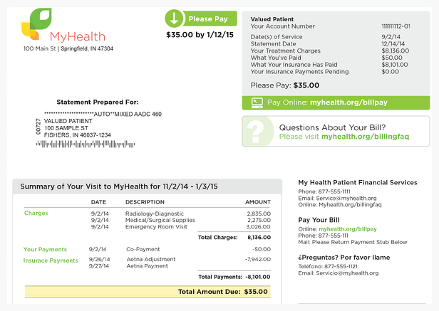
Statements that do contrast well typically create a color hierarchy that provides easy-to-recognize contrast between “base” and “accent” colors.
• Base color acts as a nuts-and-bolts foundation for your statement. It’s used to break up the background, segment important information, and guide eye movement. Base color is typically used to shade elements like call-out boxes and headers.
• Accent color is used for emphasis only. It’s typically the boldest shade on a statement, and should be used sparingly to provide the most impact. Selective use of a bold accent color can help customers key-in on information that drives response – including amount due, financial assistance or payment plans, or payment options.
Best-practice statements use base and accent color to create a hierarchy that effectively teaches your customers the best way to read and respond to your billing. Once again, the goal is not to pick the “right” colors, it’s to maximize their impact by presenting a hierarchy that helps customers quickly understand what they owe and how to pay.

The Importance of Font Color
Which of the following statements do you think is true:
Barack Obama was born in 1955. Barack Obama was born in 1964.
That’s actually a trick question as neither option is correct (President Obama was really born in 1961).
But if you’re like most people, you probably selected the second response. Why? Experiments have shown that respondents are more likely to believe a message the more it stands out in contrast to its background or to surrounding text.
Thinking is hard. It exerts mental focus, changes our emotional state, burns calories, and even summons extra blood, oxygen, and glucose to the brain. To avoid unnecessary strain, our brains are naturally wired to believe and take action upon what is familiar and easy to process – a process psychologist and Nobel Laureate Daniel Kahneman calls cognitive ease.
Leveraging that idea on your statement design is as simple as creating clear contrast between text and background. For example, clean, legible black font is preferable to a lighter shade of gray. The latter might seem more aesthetically pleasing, but it tends to blend into a lighter background – reducing legibility and cognitive ease.
If you use choose to use colored text – for headlines or to emphasize key payment information and instructions, for example – go with bold shades that maximize legibility and clarity. Bright shades like red and blue outperform middling colors like green, yellow, or light blue not because they elicit an emotional response, but because they make it easier for people to understand your message and take action.
Once again, the key is using color to create context and a clear sense of contrast between critical information and less important billing details.
Conclusion
Using color to improve customer financial communications isn’t exactly rocket science. The big takeaway is this: no matter what color combinations you choose, make sure that you’re using colors to create contrast and guide visual path.
High performing statements present use base and accent colors to create an effective hierarchy that makes it very simple for customers to read, understand, and take action on billing cues.
So ignore the pseudo-science. Blue isn’t an inherently calming color – and it won’t likely cause customers to immediate take action on a past-due notice. But if used in coordination with other colors to provide contrast and a clear visual hierarchy, it can reduce confusion and promote faster balance payment.
Get Updates
Featured Articles
Categories
- Charity Care Management (1)
- Compliance (2)
- Customer Service (8)
- Digital Front Door (1)
- Direct Mail (6)
- eBilling (1)
- EBPP (34)
- ESL Statement (2)
- eStatement (1)
- Healthcare Channel Partner Billing (1)
- IVR (3)
- Mobile Payment (11)
- Online Billing and Payment (6)
- Online Patient Payment (17)
- Outsource Print Management (4)
- Paperless Billing (4)
- Patient Engagement (2)
- Patient Friendly Billing (21)
- Print and Mail (7)
- QR Codes (1)
- Quick Pay (7)
- Security (1)
- Self-Pay Patients (9)
- Self-Pay Revenue (4)
- Statement Design (32)
- Statement Print and Mail (1)
- Statement Printing and Mailing (28)
- Statement Processing (36)
- TransPromo (1)
- Up-Front Billing (1)


